
LYBRA FINANCE
LYBRA FINANCE
LYBRA FINANCE
Branding
Branding
UI/UX
UI/UX
Case Study
Case Study

OVERVIEW
ABOUT
Lybra is a modern peer-to-peer payment solution designed to simplify how people send, receive, and manage money. Lybra reimagines financial transactions making it fast, secure, and borderless.
Lybra is a modern peer-to-peer payment solution designed to simplify how people send, receive, and manage money. Lybra reimagines financial transactions making it fast, secure, and borderless.
CHALLENGE
Sending money shouldn’t feel like jumping through hoops. But for many people, it still does. From clunky interfaces to delays and confusing steps, the process is often more stressful than it should be. People just want something that works quickly, clearly, and without friction.
Sending money shouldn’t feel like jumping through hoops. But for many people, it still does. From clunky interfaces to delays and confusing steps, the process is often more stressful than it should be. People just want something that works quickly, clearly, and without friction.

01
PROCESS
PROCESS
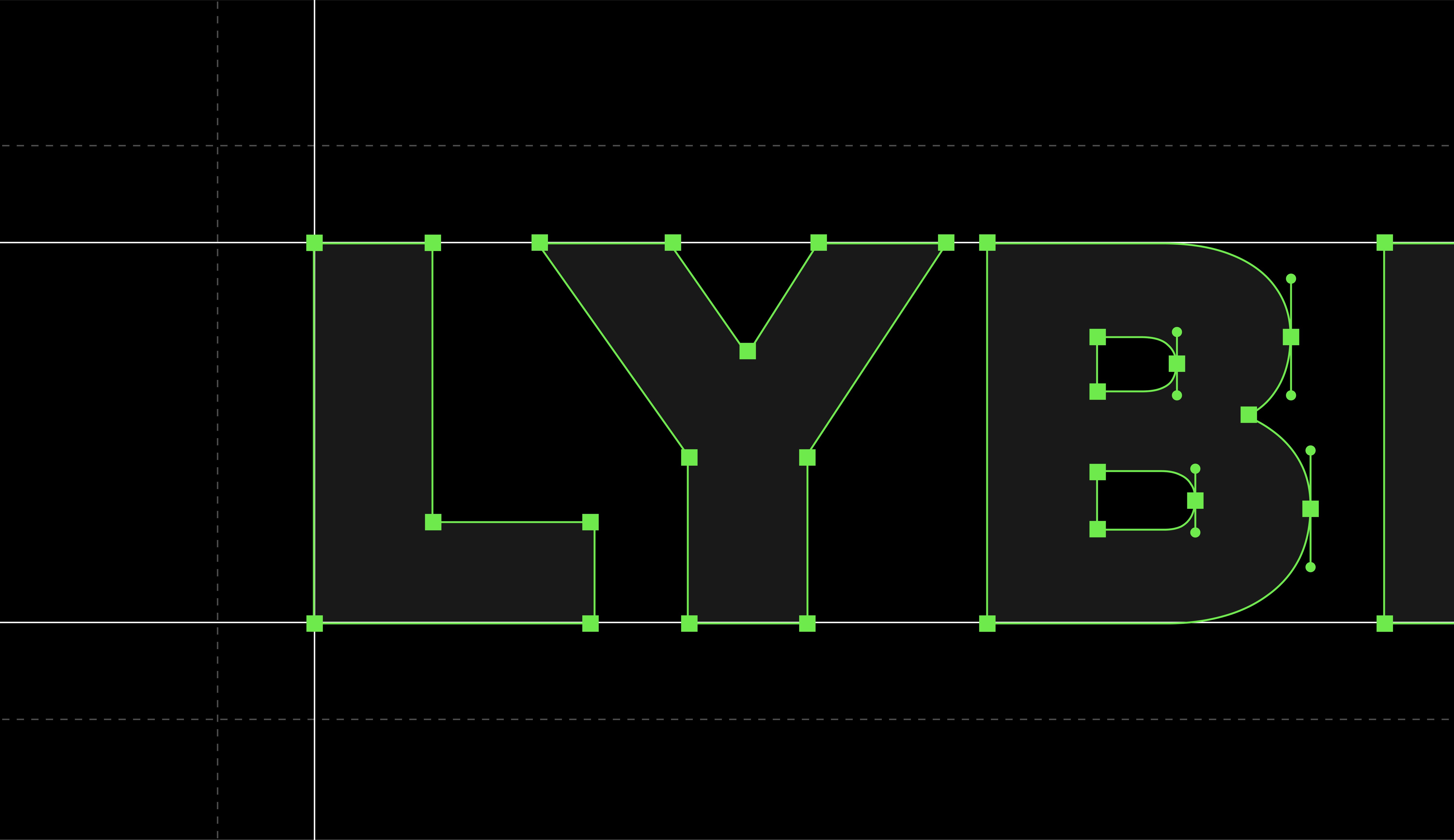
Brand Foundation
We began by defining what the platform should feel like: freedom, clarity, and confidence when moving money. From that vision we chose a green palette to evoke growth and motion. We designed a logo system that adapts effortlessly from tiny mobile icons to large banners. We also developed a warm, approachable voice that reads like a conversation with a friend.
We began by defining what the platform should feel like: freedom, clarity, and confidence when moving money. From that vision we chose a green palette to evoke growth and motion. We designed a logo system that adapts effortlessly from tiny mobile icons to large banners. We also developed a warm, approachable voice that reads like a conversation with a friend.


02
PROCESS
PROCESS
Designing the Product Experience
With a bold brand direction in place, we focused on crafting a digital experience that feels intuitive, trustworthy, and distinctly modern. From the landing page to every in-app screen, we designed each interaction to make finance feel fluid. By stripping away friction and emphasizing clarity and minimalism, we let users concentrate on moving money instead of figuring out how.
With a bold brand direction in place, we focused on crafting a digital experience that feels intuitive, trustworthy, and distinctly modern. From the landing page to every in-app screen, we designed each interaction to make finance feel fluid. By stripping away friction and emphasizing clarity and minimalism, we let users concentrate on moving money instead of figuring out how.


03
PROCESS
PROCESS
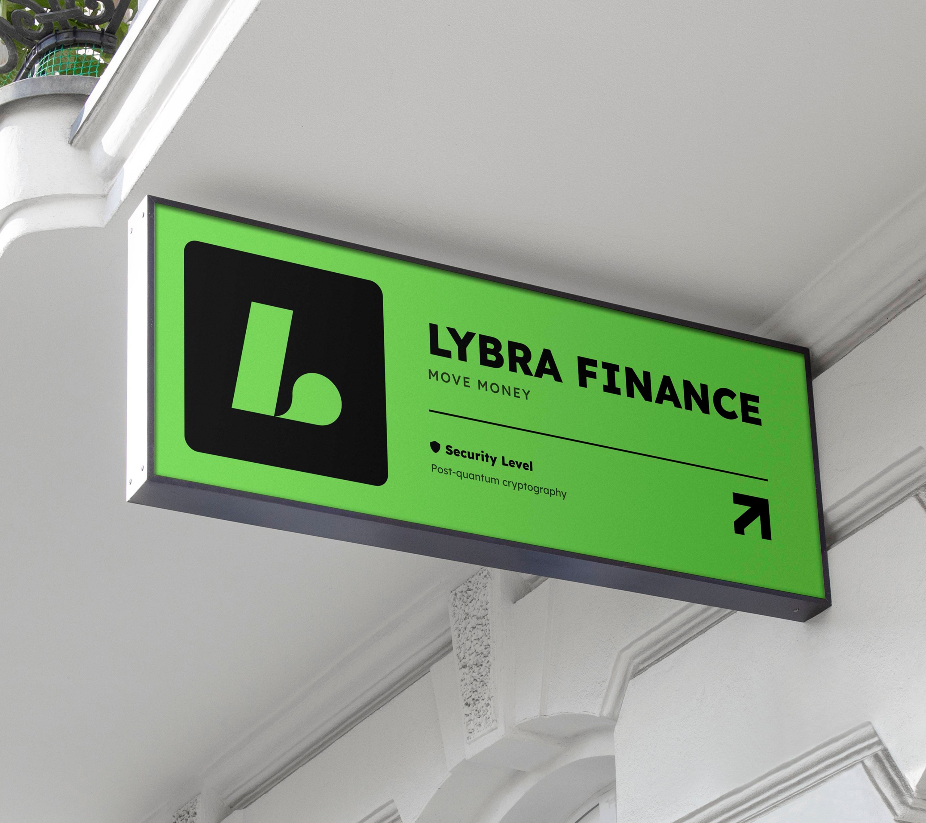
Activation & Touchpoints
Finally, we brought the new identity into the real world and digital spaces alike. Bold, text-driven social media visuals capture attention. Sleek tote bag designs turn everyday carry into a brand statement. Large-format displays showcase the idea that money can flow as effortlessly as your day.
Finally, we brought the new identity into the real world and digital spaces alike. Bold, text-driven social media visuals capture attention. Sleek tote bag designs turn everyday carry into a brand statement. Large-format displays showcase the idea that money can flow as effortlessly as your day.


Hire Us
Let's Talk
All rights reserved 2025
Let's Talk
All rights reserved 2025
Let's Talk
All rights reserved 2025
Let's Talk
All rights reserved 2025
Let's Talk
All rights reserved 2025