
NOMAD
NOMAD
Branding
Branding
UI/UX
UI/UX
Case Study
Case Study

[ Project Overview ]
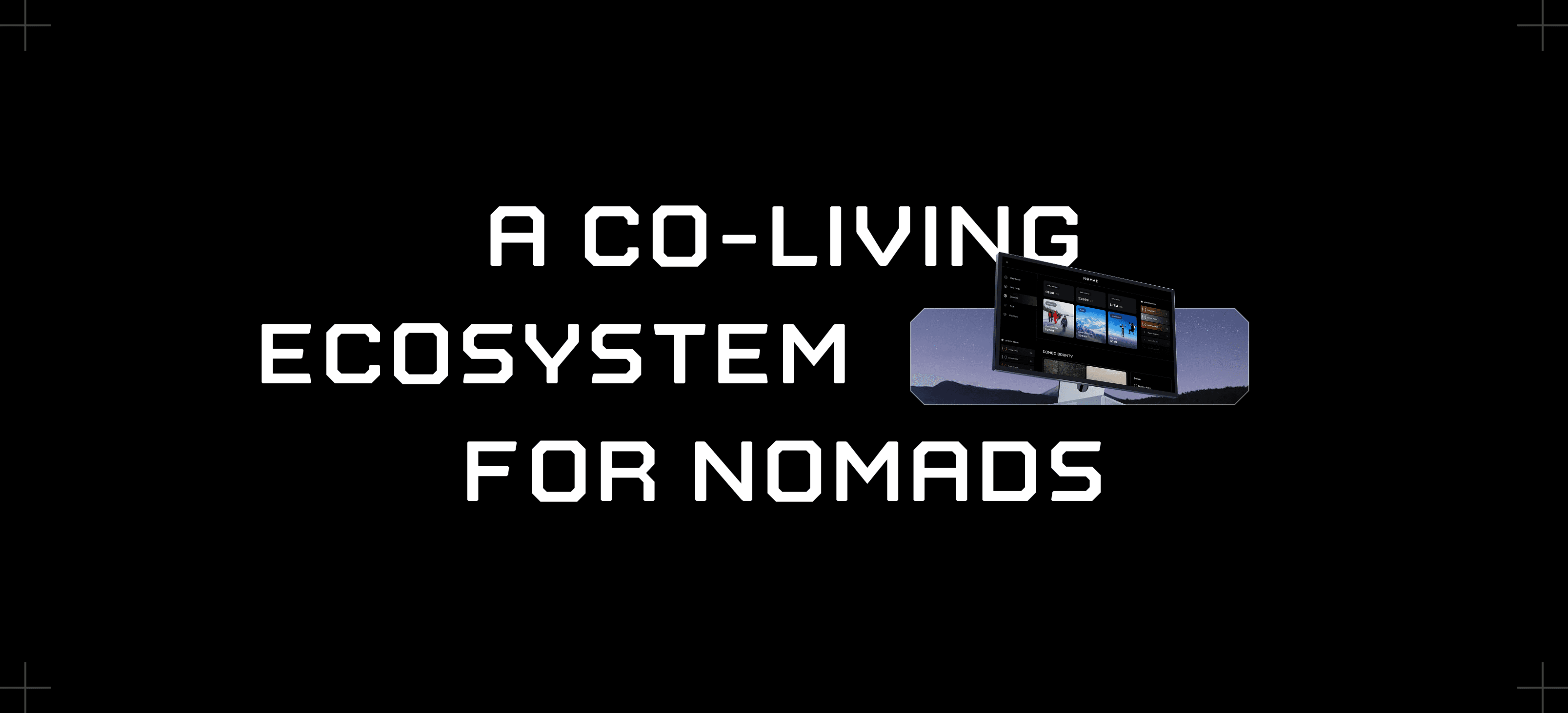
NOMAD is a global living network designed to make location-independent life more accessible, social, and investable. The vision spans physical Nodes (places to live, work, and gather), a digital community layer, and a long-term platform for bookings, collaboration, and ownership.
NOMAD is a global living network designed to make location-independent life more accessible, social, and investable. The vision spans physical Nodes (places to live, work, and gather), a digital community layer, and a long-term platform for bookings, collaboration, and ownership.

[ Challenge ]
The challenge was not just designing screens — it was turning an ambitious, abstract idea into a coherent, usable product system that could scale across multiple touchpoints and audiences.
The challenge was not just designing screens — it was turning an ambitious, abstract idea into a coherent, usable product system that could scale across multiple touchpoints and audiences.
WHAT WE DID
Once the high-level vision for NOMAD was defined, our role was to translate that vision into a structured, usable, and scalable product ecosystem. This meant moving beyond isolated screens and treating NOMAD as a system that would live across marketing, product, and investor surfaces.
Once the high-level vision for NOMAD was defined, our role was to translate that vision into a structured, usable, and scalable product ecosystem. This meant moving beyond isolated screens and treating NOMAD as a system that would live across marketing, product, and investor surfaces.
[ Deliverables ]
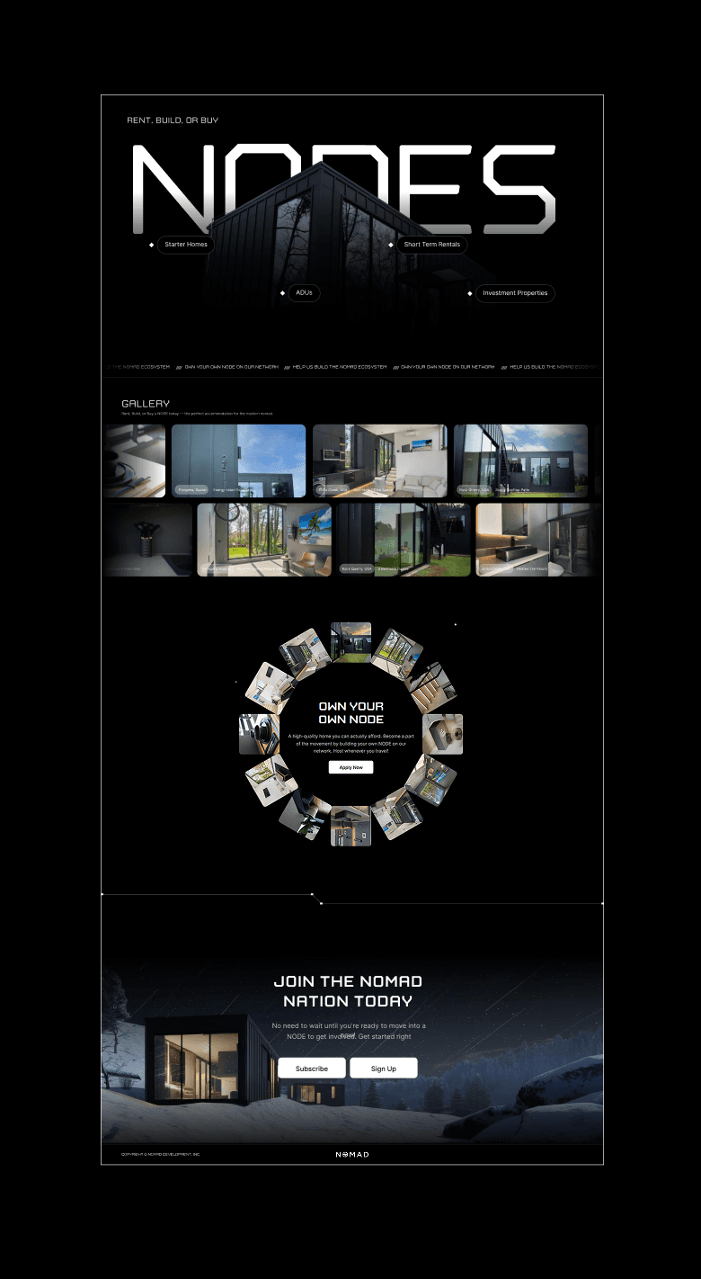
Brand
Website Design
Webapp Design
Mobile app Design
Pitch deck
[ Color System]
Grayscale
Accent colors are used sparingly and purposefully, ensuring the system remains flexible as new features, regions, and Nodes are introduced.
Accent colors are used sparingly and purposefully, ensuring the system remains flexible as new features, regions, and Nodes are introduced.

We adopted a primarily monochromatic color system to give NOMAD a timeless, confident, and product-first identity.
By reducing visual noise and relying on contrast rather than color, the interface stays focused on content, community, and place.
We adopted a primarily monochromatic color system to give NOMAD a timeless, confident, and product-first identity.
By reducing visual noise and relying on contrast rather than color, the interface stays focused on content, community, and place.
Typography
Typography
Typography
[ Typeface Used ]
We paired the sci-fi font Nostromo as the primary typeface with Inter as the supporting sans-serif to balance vision with usability.
We paired the sci-fi font Nostromo as the primary typeface with Inter as the supporting sans-serif to balance vision with usability.


Webapp
overview
Webapp overview
The NOMAD web app is the central hub for the community, bringing together chat, forums, events, bookings, and Node information into a single, geo-aware interface. It supports members in discovering people, places, and opportunities while maintaining clarity across dense content and interactions.
The NOMAD web app is the central hub for the community, bringing together chat, forums, events, bookings, and Node information into a single, geo-aware interface. It supports members in discovering people, places, and opportunities while maintaining clarity across dense content and interactions.
Problem
The challenge was to organize a complex, multi-layered ecosystem without overwhelming users. NOMAD needed a platform that could handle:
Real-time chats and threaded forums
Location-based content (Regions, Cities, Nodes)
Events, bookings, and bounties
User profiles, reputation, and trust systems
The challenge was to organize a complex, multi-layered ecosystem without overwhelming users. NOMAD needed a platform that could handle:
Real-time chats and threaded forums
Location-based content (Regions, Cities, Nodes)
Events, bookings, and bounties
User profiles, reputation, and trust systems
Solution
We designed a unified web app experience that blends real-time chat and structured forums, with location-aware tools and clear content hierarchy. Key elements include:
Three-column layout (Navigation | Content | Context/AI)
Geo-filtered feeds and maps
Modular components for threads, events, and bookings
AI-assisted summaries, deduplication, and concierge actions
[ Web Design ]
Our
Approach
Our
Approach
System-first thinking: We mapped all content types, user roles, and interactions before designing screens.
Hybrid layout design: Created a consistent three-panel interface to unify chat, forums, and context tools.
Geo-aware design: Content and events are filtered by Region → City → Node to make the experience feel local and relevant.
Iterative prototyping: Screens were tested and refined to balance dense information with usability.
AI integration: Embedded summaries, dedupe, and concierge commands to reduce cognitive load and highlight relevant actions.


Mobile App
Mobile App
The NOMAD mobile app is designed to support members while they’re on the move, prioritizing presence, discovery, and real-time connection. It acts as the lightweight, always-available layer of the NOMAD ecosystem, complementing the depth of the web app.
The NOMAD mobile app is designed to support members while they’re on the move, prioritizing presence, discovery, and real-time connection. It acts as the lightweight, always-available layer of the NOMAD ecosystem, complementing the depth of the web app.

Investors
Pitch Deck
Investors Pitch Deck
The NOMAD pitch deck was designed to clearly communicate the vision, product, and opportunity to investors. Our goal was to translate a complex, multi-layered platform into a narrative that felt focused, credible, and easy to grasp, without oversimplifying the ambition behind the product.

Investors
Pitch Deck
The NOMAD pitch deck was designed to clearly communicate the vision, product, and opportunity to investors. Our goal was to translate a complex, multi-layered platform into a narrative that felt focused, credible, and easy to grasp, without oversimplifying the ambition behind the product.
[ Client Words ]
Working with ParadigmID has been transformative for NOMAD. They took our broad vision and translated it into a usable product across website, mobile, and web platforms,
Their process was structured and 100% intentional
Working with ParadigmID has been transformative for NOMAD. They took our broad vision and translated it into a usable product across website, mobile, and web platforms,
Their process was structured and 100% intentional
Zach Milburn
Zach Milburn
CEO of Nomad
CEO of Nomad


Designed by Paradigm
Designed by Paradigm
Let’s Design Yours
Let’s Design Yours
Hire Us
Let's Talk
All rights reserved 2025
Let's Talk
All rights reserved 2025
Let's Talk
All rights reserved 2025